How to identify the font in a screenshot or logo
Screenshots and logos need different approaches: check system and web fonts first, crop at full resolution, and spot custom logo lettering.
Screenshots and logos are the two most common sources of the question "what font is this?", and they behave very differently. Interface text in a screenshot is usually a known system or web font, rendered sharp and flat. A logo is often drawn or modified by a designer. Start by working out which case you have, because it decides whether you are looking for an exact name or a close substitute.
For the image-based part, open the font finder. The general method is in how to find a font from an image. This guide covers what is specific to screenshots and logos.
Screenshots: check the obvious sources first
If the screenshot shows a website you can open
Skip image identification altogether. Open the page in a desktop browser, right-click the text and choose Inspect:
- In Chrome or Edge, open the Computed tab and scroll to Rendered Fonts. It lists the font the browser actually used for that text, which may differ from the first name in the CSS
font-familylist. - In Firefox, open the Fonts panel in the Inspector to see the fonts used on the selected element.
This gives you the real font name. An image-based font finder can only estimate it.
If it is an operating system or app interface
Interface text often uses the platform's system font:
| Where the screenshot comes from | Likely starting point |
|---|---|
| iPhone, iPad or Mac interface | San Francisco (SF Pro) |
| Windows interface | Segoe UI |
| Android interface | Roboto |
Treat this as a first guess, not a rule. Many apps and websites ship their own brand fonts, and newer system versions change details. Compare the distinctive letters before you rely on it.
Make the screenshot easier to compare
- Use the original capture. Screenshots forwarded through chat apps are often resized and recompressed, which blurs small text.
- Crop at full resolution. On high-density displays a screenshot can be two or three times larger than it appears on screen. Keep those pixels; do not shrink the image before uploading.
- Pick a label with character. A short button label like "OK" says little. A heading or sentence with "a", "g", "R" and numerals gives the comparison more to work with.
- Handle dark mode the same way. Light text on a dark panel compares fine, but check that the crop includes enough of the panel around the letters.
Then upload the screenshot to the font finder, select one line and compare the candidates in the Font library. Many product interfaces use open-source families such as Inter or Roboto. Inter and Roboto are both in TwinFont's comparison set, so if the original is one of them you can use it directly.
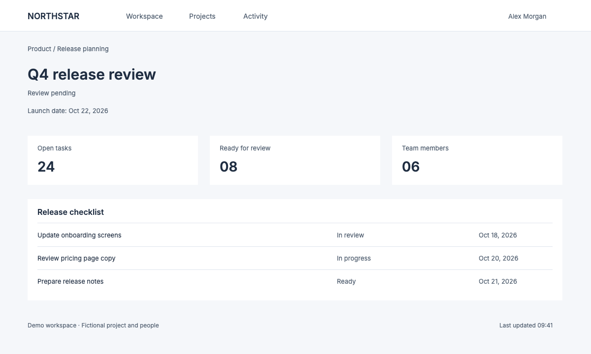
A demo interface from the screenshot editor examples. Its edited version used the known Inter font, which was supplied rather than identified automatically.
Logos: decide whether it is a font at all
Logos are where font identification most often fails, and usually for a good reason: the wordmark was never a font.
Signs you are looking at custom lettering
- Letters connect, overlap or share strokes in ways normal typing would not produce.
- One letter has an unusual detail, such as a cut, a swash or a symbol inside it, that the others do not.
- Spacing between each pair of letters looks individually adjusted.
- The candidate list shows close families, but none matches the most distinctive letter.
In these cases the designer often started from a typeface and modified it, or drew the letters from scratch. The honest result is "closest available family", not a name.
Where to find the real answer
- Brand guidelines and press kits. Many companies publish their typefaces on brand, media or press pages.
- The company's website. The logo may be an image, but the site's headings often use the brand font. Inspect them as described above.
- The designer or agency. If you are working for the brand, ask for the font files and the license.
Using what you found responsibly
A close match is fine for mockups, internal drafts and your own designs. Do not recreate another company's logo for your own product, and do not edit someone else's branded material to mislead people. TwinFont's acceptable use policy covers this.
Posters, packaging and photos
Printed text in photos sits between the two cases. It is often a real font, but perspective, curved surfaces, texture and lighting distort it. Photograph or choose an image taken straight on, compare one line at a time, and expect to adjust weight and spacing after choosing a family. The poster text editor shows this on a textured print example.
After you identify the font
If the goal is to change the text in the screenshot itself, you do not have to stop at a name. Apply the matching candidate, or use Load a font to add the original file if you have it, and then type the new label. The screenshot text editor keeps the PNG at its original dimensions. The blog guide on editing screenshot text covers baselines, spacing and checking the export.
To hide private details instead of rewriting them, use the blur text in image tool. A solid cover is safer than swapping in a different name.
Quick answers
Can I find the font of an app from a screenshot? You can get close candidates. For the exact name, check whether the app uses the platform's system font or look for the developer's brand guidelines.
Why does the font finder not recognize my logo? Most likely the logo is custom or modified lettering. Pick the closest family for your own work, or ask the brand for its font.
Is it better to identify a font from a screenshot or a photo? A clean, original screenshot is usually easier because the text is flat and sharp. Photos add perspective, texture and blur.