How to find a font from an image
Identify a font from a photo or screenshot: crop one clear line, compare candidates by letter shape, read similarity scores and pick a free lookalike.
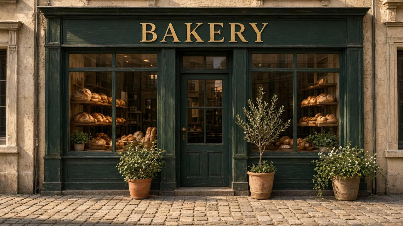
To find a font from an image, crop one clear line of text, run it through a font finder, and compare the suggested candidates letter by letter against the original. Pick the family whose distinctive letters match, then test your own wording at the final size. If none matches exactly, the original is probably a commercial or custom typeface, and a close lookalike you are allowed to use is the practical answer.
You can follow along with the font finder. The rest of this guide explains each step and the mistakes that make a font identifier return the wrong answer.
What a font finder can and cannot tell you
A JPG, PNG or screenshot stores colored pixels, not a font name. Any image-based font identifier, including TwinFont, compares the visible letter shapes with the fonts it knows and ranks the closest ones. That has three consequences:
- The answer is a shortlist, not proof. In TwinFont the score next to each candidate compares letter shapes. It is not the probability that the candidate is the exact original font.
- The library limits the result. If the original font is not in the comparison set, the best result is a close relative. The TwinFont font finder compares more than 40 free Google Fonts, including Inter, Roboto, Open Sans, Montserrat, Poppins, Oswald, Bebas Neue, Playfair Display, Merriweather, EB Garamond, Pacifico and Great Vibes, plus fonts available on your device and any font file you load. Each suggestion links to its free Google Fonts page.
- Logos are a special case. Many wordmarks use custom or modified lettering. No tool can name a typeface that was drawn for one brand.
If you have the original design file, open it and read the font name from the text layer. That is always more reliable than identifying the font from an image.
Step 1: Prepare an image the comparison can read
Most wrong answers start with a poor crop. Before you upload, check the image against this list:
| Problem in the image | What to do |
|---|---|
| Several lines and styles mixed together | Compare one line, or one style, at a time |
| Small, blurry or heavily compressed text | Use the largest original you have; avoid screenshots of screenshots |
| Text at an angle or on a curved surface | Prefer a straight-on photo; perspective changes letter widths |
| Busy photo behind the letters | Crop closer so the letters dominate the selection |
| Only a few plain letters visible | Include distinctive glyphs such as a, g, R, Q, y or numerals |
Distinctive letters matter more than long text. The two-storey "a", the tail of a "Q" and the leg of an "R" separate families that look identical in letters like "o" or "l".
Step 2: Select the right line of text
Upload the image on the font finder page. Local recognition detects text lines in your browser. Select the line you want to identify. If the text you care about was not detected, use Find missed text or draw a box around it.
Check Recognized original text before you compare fonts. If recognition misread an "O" as a zero or dropped a letter, correct it. The comparison renders that text in every candidate font, so wrong letters give misleading previews.
Step 3: Compare candidates by letter shape
Open the Font library. For the selected line you will see the Original image text crop next to Original text in this font for each candidate, with a similarity score. Use the score to decide which candidates to inspect first, then judge them with your own eyes:
- Serifs. Are there small strokes at the ends of letters? Are they thin, bracketed or heavy slabs?
- Stroke contrast. Do strokes vary from thick to thin, as in many serif faces, or stay even?
- Proportions. Is the face wide like Montserrat or condensed like Oswald? Compare the width of an "M" or "O".
- Terminals. Do the ends of "c", "e" and "s" finish flat, angled or rounded?
- Distinctive letters. Check "a", "g", "R", "Q", "y" and numerals one by one.
The category filters (Serif, Sans serif, Condensed, Monospace, Handwriting and Simplified Chinese) help when the first suggestions are clearly in the wrong family. For example, if the source has slab serifs, filter to serif fonts before comparing details.
Serif capitals: compare serif shape, stroke contrast and the leg of the R.
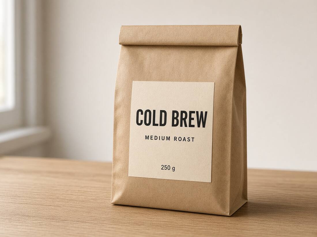
Two styles on one label: compare COLD BREW and MEDIUM ROAST separately.
These are the sample images on the font finder page. They show which clues to look at. They are not accuracy benchmarks.
Step 4: If you already own the font, load it
Sometimes you suspect the font but want to confirm it, or a client sent the brand font file. Use Load a font to add a TTF, OTF, WOFF or WOFF2 file you have permission to use. It appears with your device fonts and can be compared like any other candidate. Make sure you loaded the right weight: a regular and a semibold file can share a family name but look different.
"Where can I find a font like this?"
When nothing matches exactly, decide what you actually need:
- You need the exact font for a brand or a client. Ask the owner, check the company's brand or press page, or look at the original design files. Many brand guidelines name their typefaces.
- You need something that looks right in your own design. Choose the closest candidate whose license allows your use. An open-license lookalike that matches the proportions and key letters is usually better than a free download of uncertain origin.
- You need to change the words in the image itself. You may not need the font name at all. Apply the closest candidate and adjust weight, spacing and size until the new words sit naturally beside the old ones.
Always check the license of a font you find elsewhere before using it commercially. Identifying a font does not give you the right to use it.
Step 5: Use the match to edit the text in the image
A good way to check a candidate is to type your new wording in it and look at the result at full size. In TwinFont, choose Apply selected font, type the replacement, and then fine-tune Weight, Spacing (px), size and position. The guide to matching the font when editing image text covers those adjustments in order. When you are ready, the replace text in image tool uses the same editor.
Why the font finder returns the wrong family
- The crop mixes styles. A heading and a subheading in different fonts confuse the comparison. Select one line.
- Effects hide the letter shapes. Outlines, shadows, bevels and textures make a plain font look heavier or rounder than it is.
- The text is distorted. Perspective, curved labels and low-resolution resizing change widths and stroke thickness.
- It is custom lettering. Logos, hand-painted signs and display headlines are often drawn rather than typed.
- The script is different. Latin and Chinese text need different candidates. Compare each script separately.
Quick answers
Can I identify a font from a picture for free? Yes. In TwinFont, local recognition, font comparison and text, font and color changes are free. Credits only apply to cloud AI background repair.
How accurate is a font identifier? It depends on the image and on whether the original font is in the comparison set. Treat the top candidates as a shortlist to verify, not as a final answer.
What font is this logo? It may not be a font at all. If no candidate matches the distinctive letters, the logo was probably custom drawn. Choose a close family for your own work and do not copy another brand's wordmark.